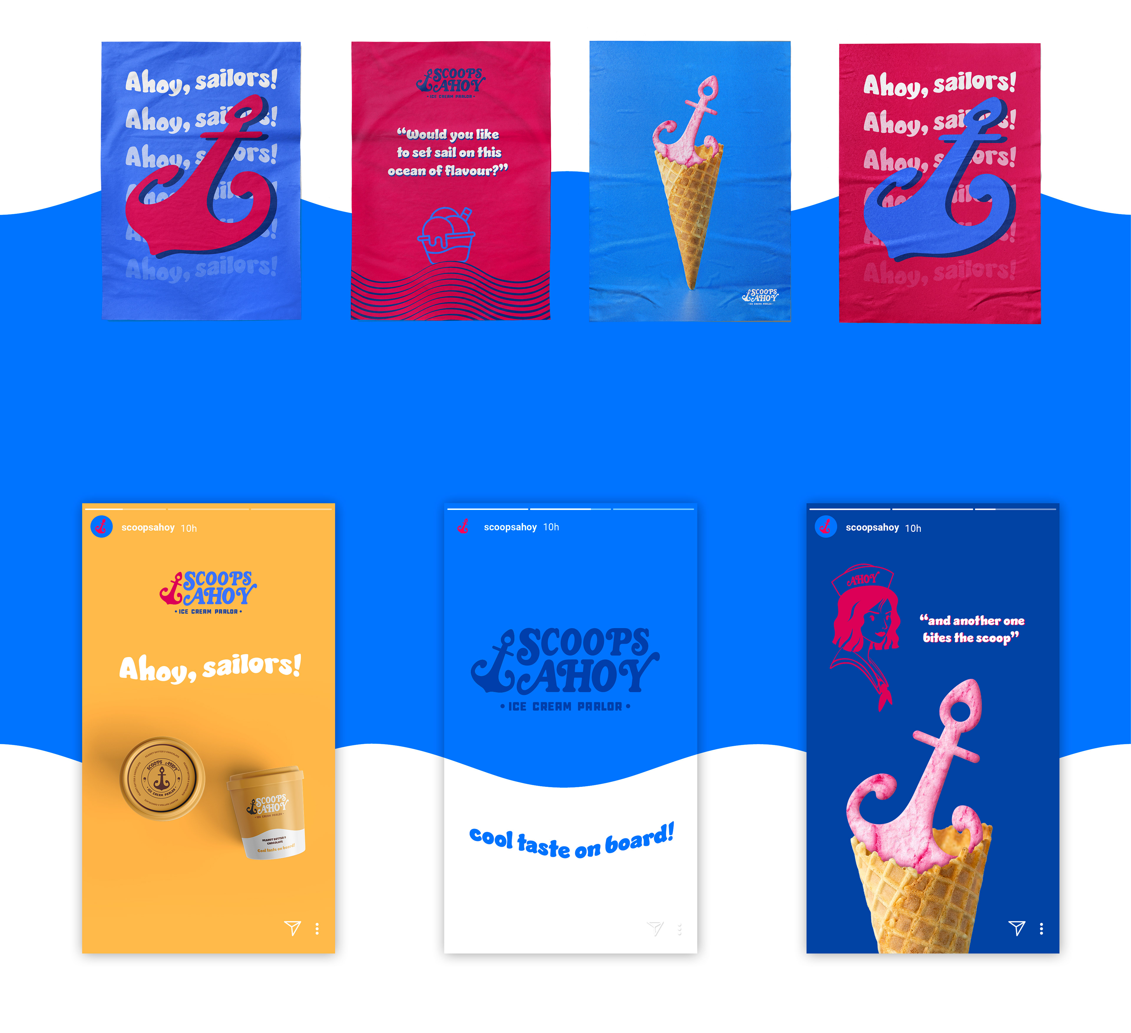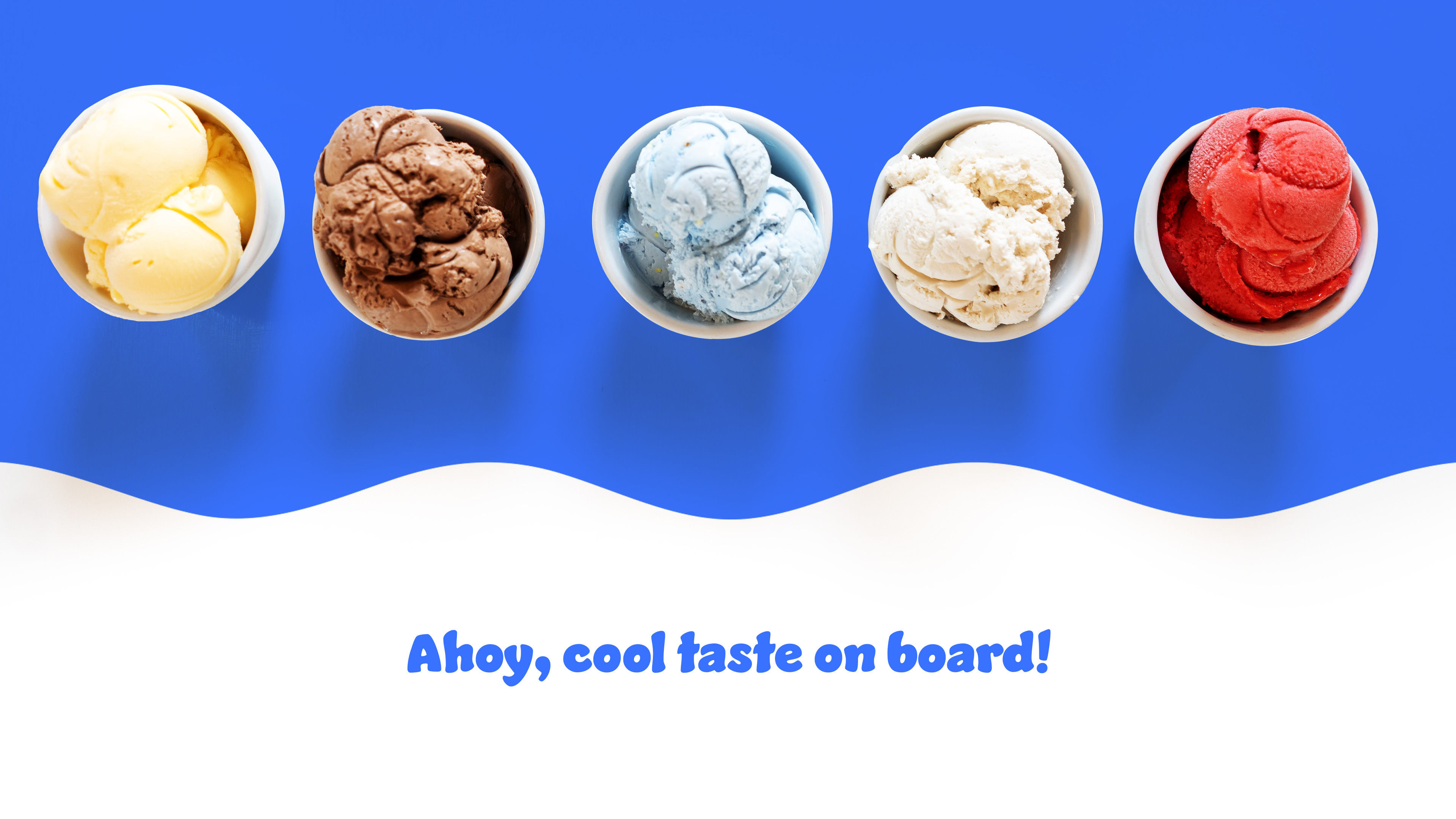
Ahoy, sailors!
Scoops Ahoy is based on the ice cream parlor that appears on Stranger Things (Netflix show). This project has been an amazing journey and I had been salivating since the beginning with all the possibilities.
It’s been a mission to transform its idea, into a highest and modern vision, showing ice cream quality through the designs. This Netflix series is a success and it was the time for their visual identity to keep up and show how cool it would be to give it life by recreating it as a today's brand that modern consumers could love and become fans.
Solution
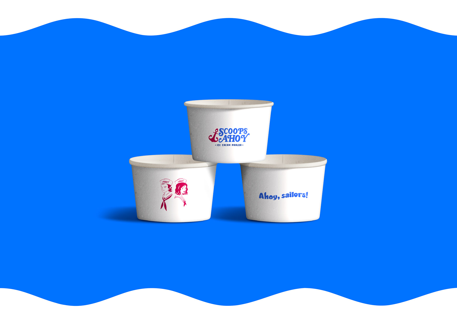
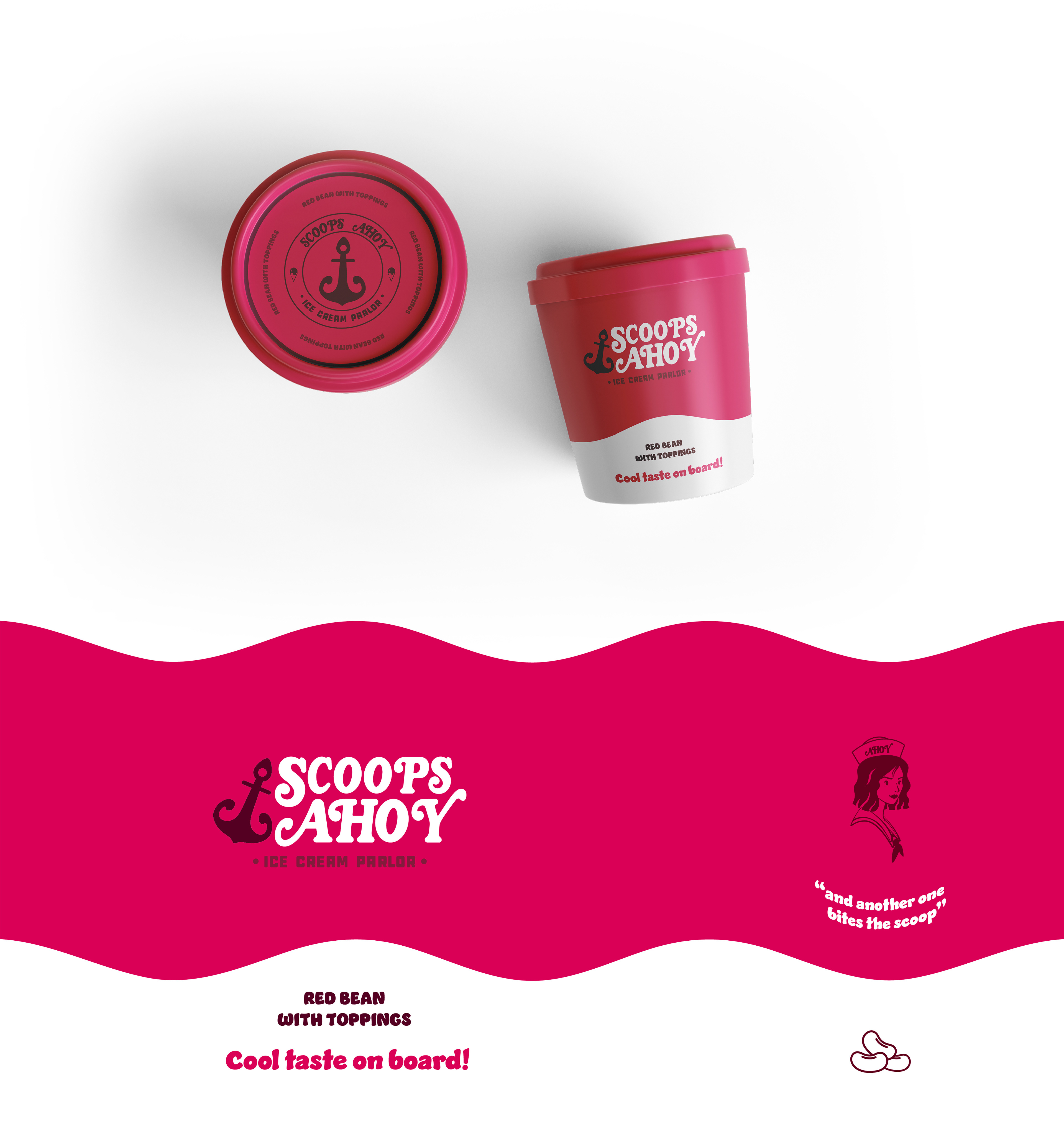
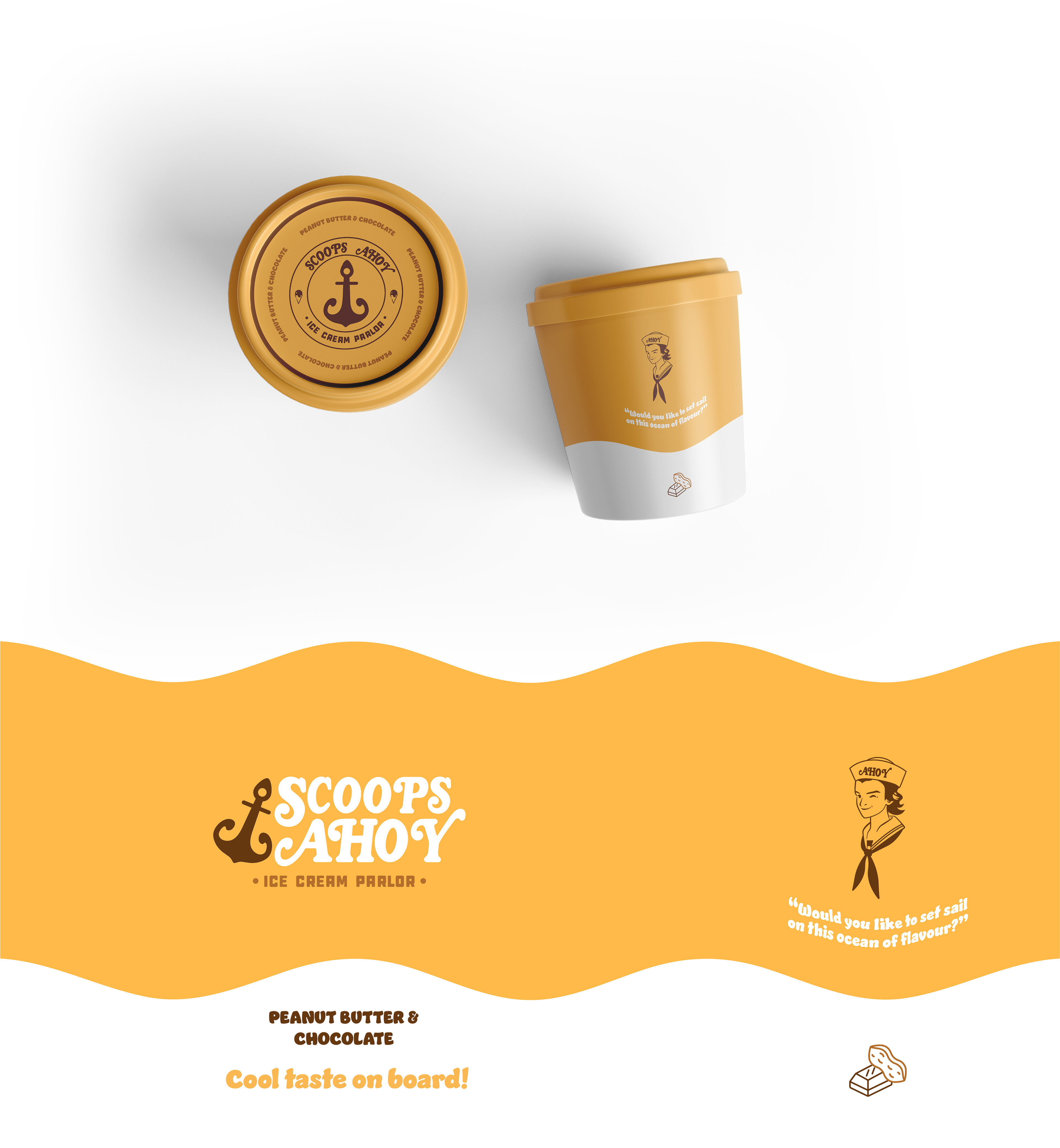
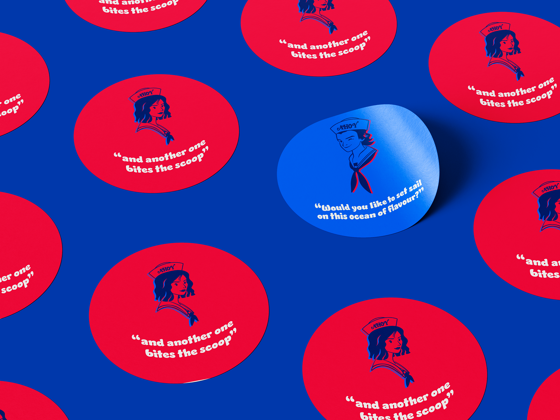
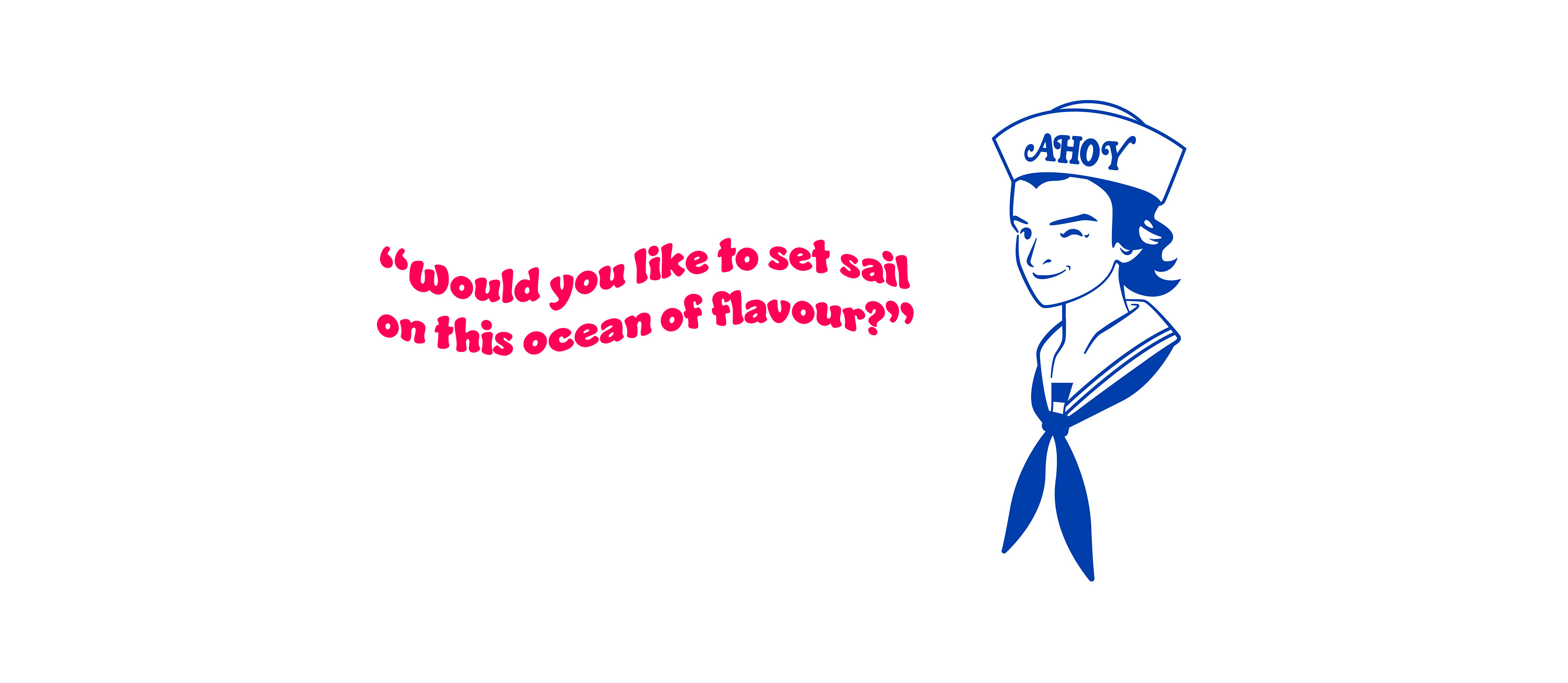
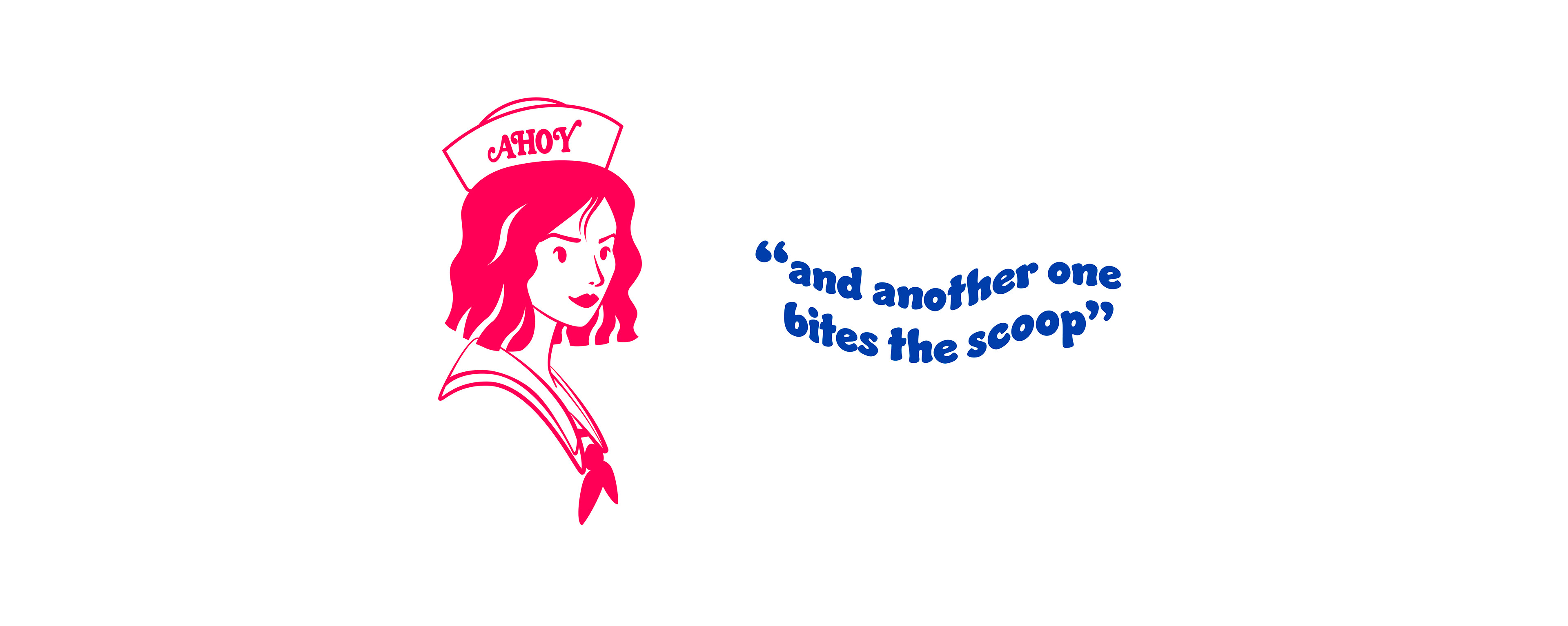
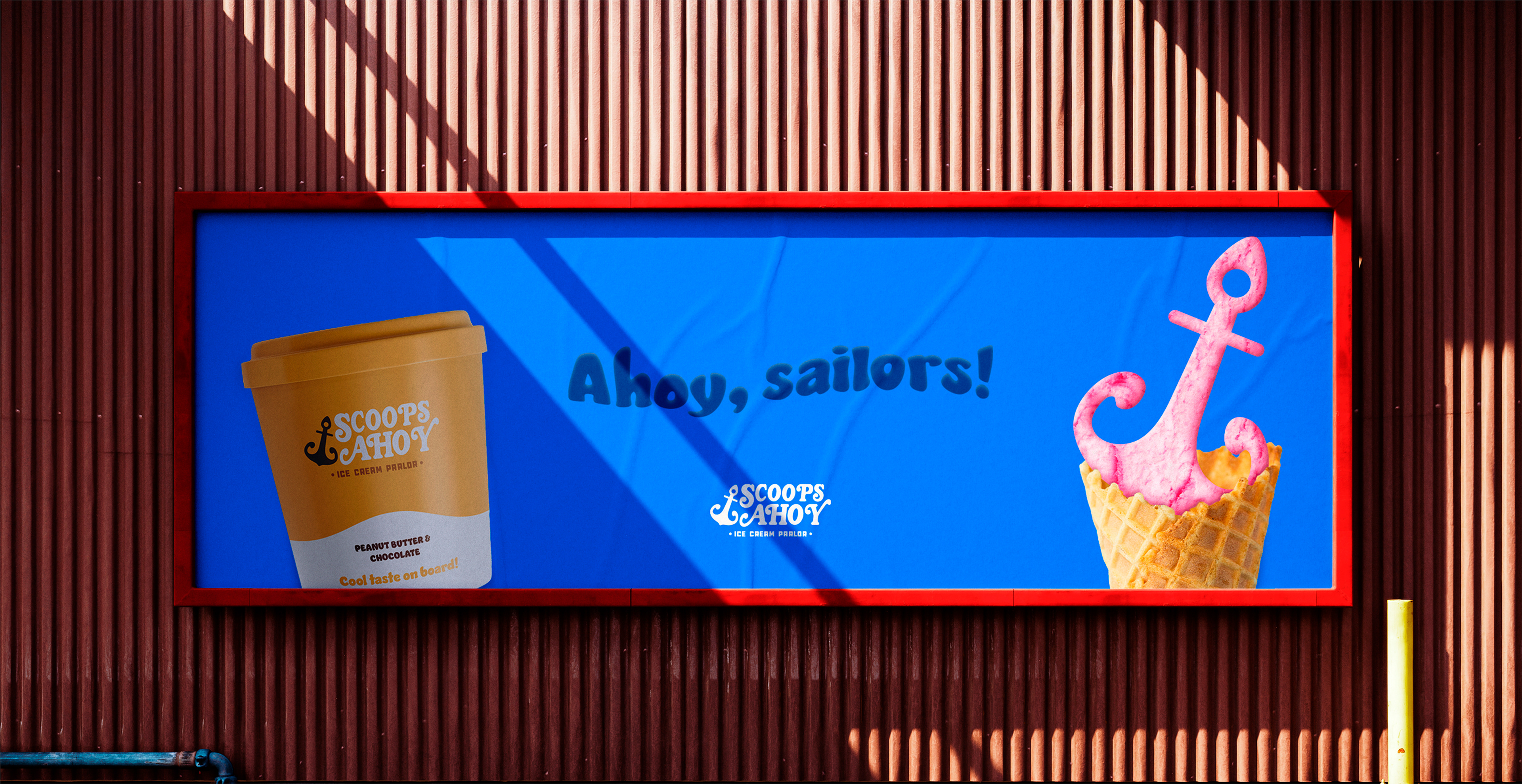
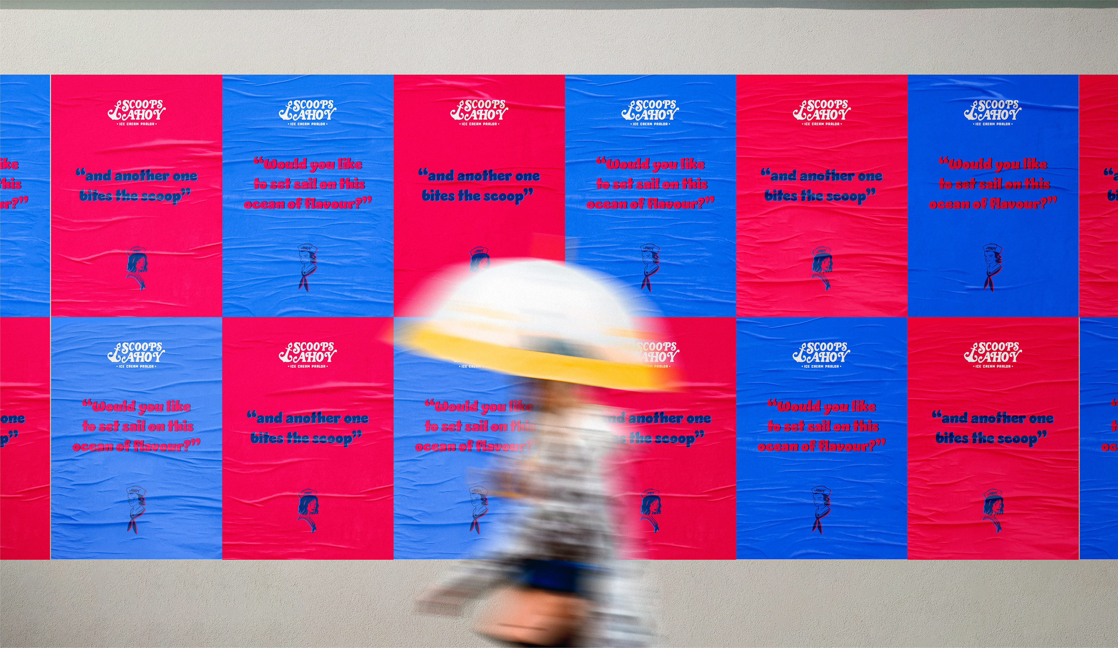
To become a nowadays brand I developed a dynamic identity with its original sailor colors and a pop tone add it. The design has a graphic line between the irony and fun of their star workers at the parlor, Steve and Robin. They carry the main ingredient of each of the flavors and have their own slogan based on their famous phrases at the parlor.
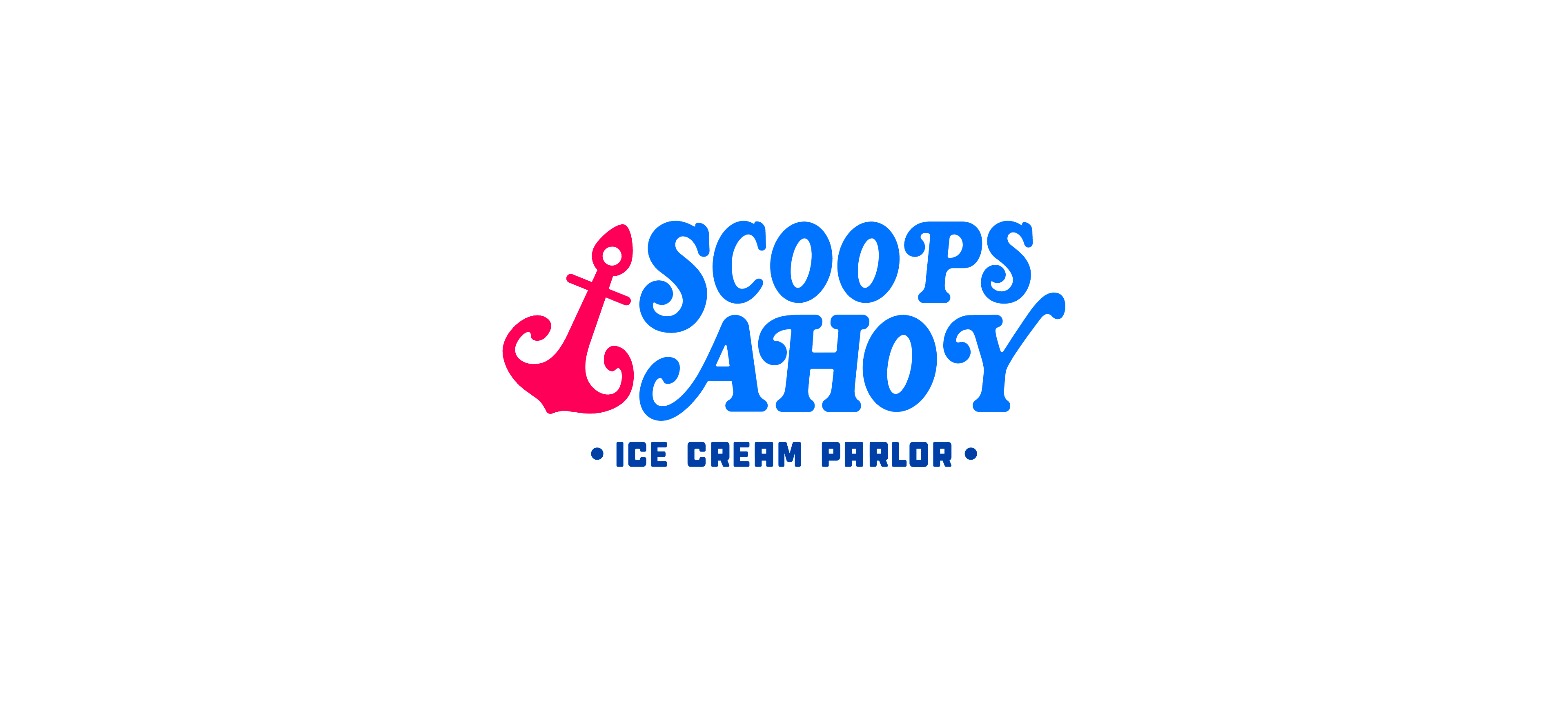
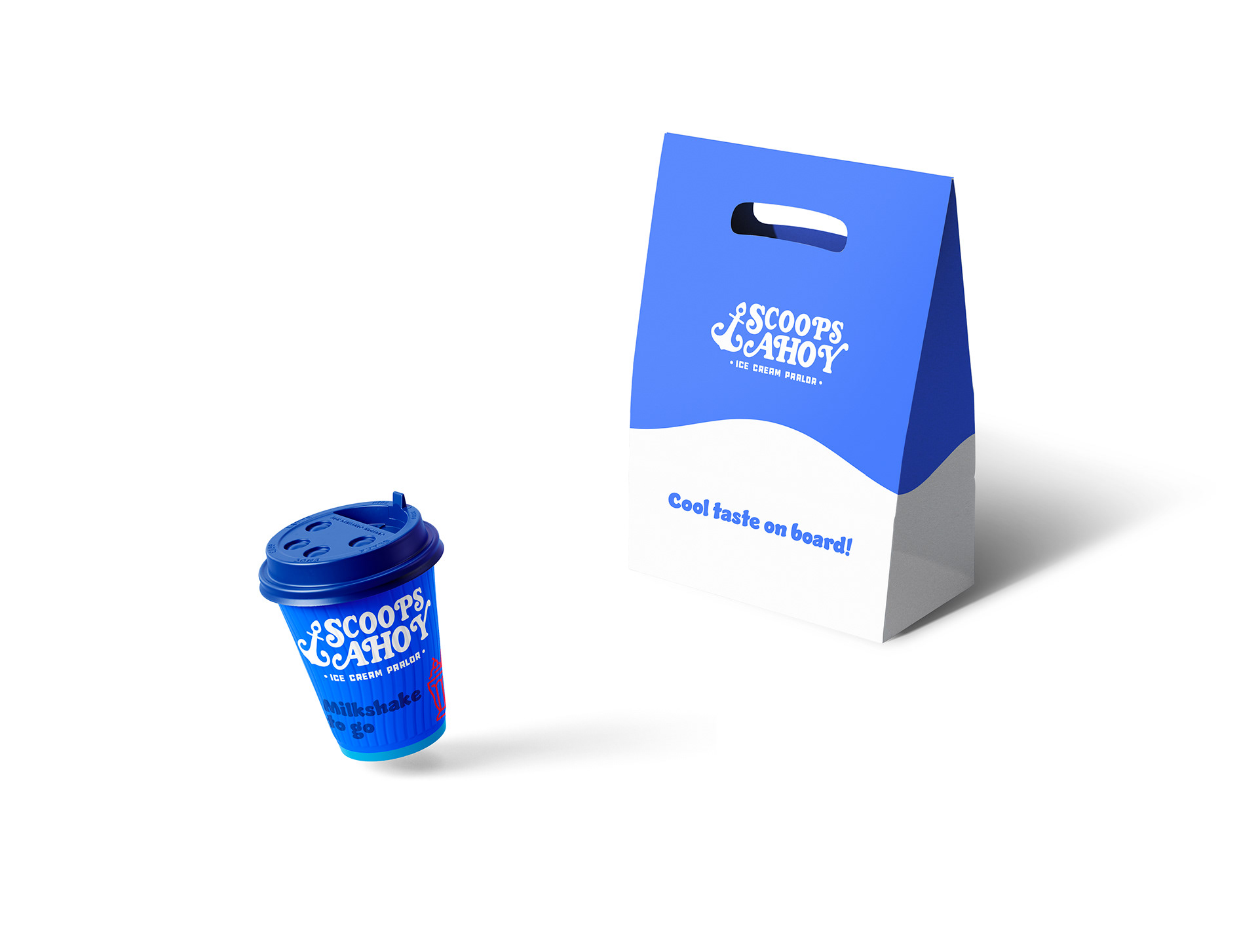
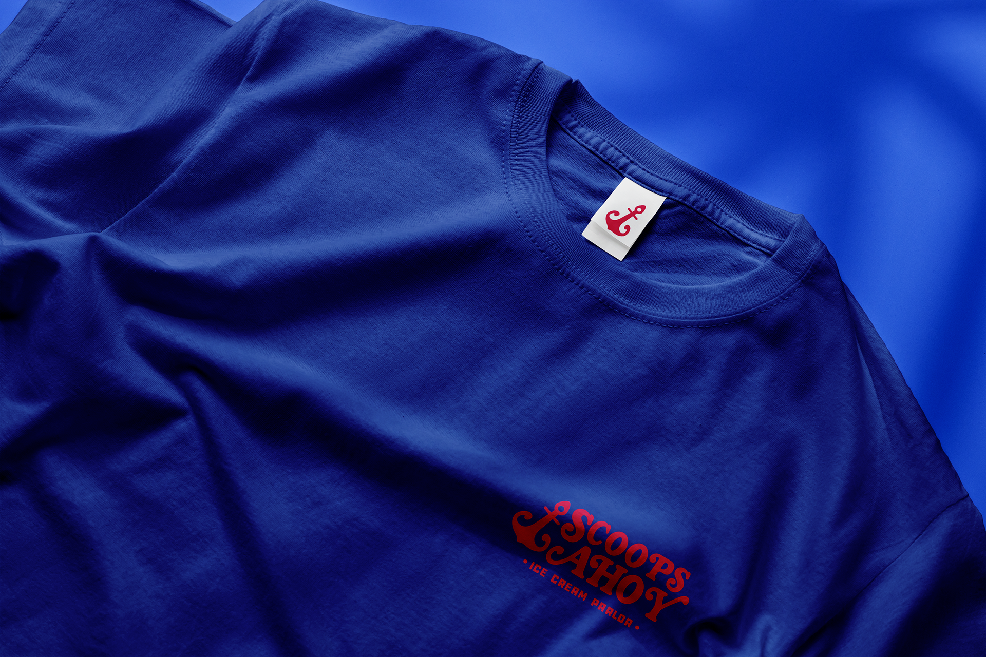
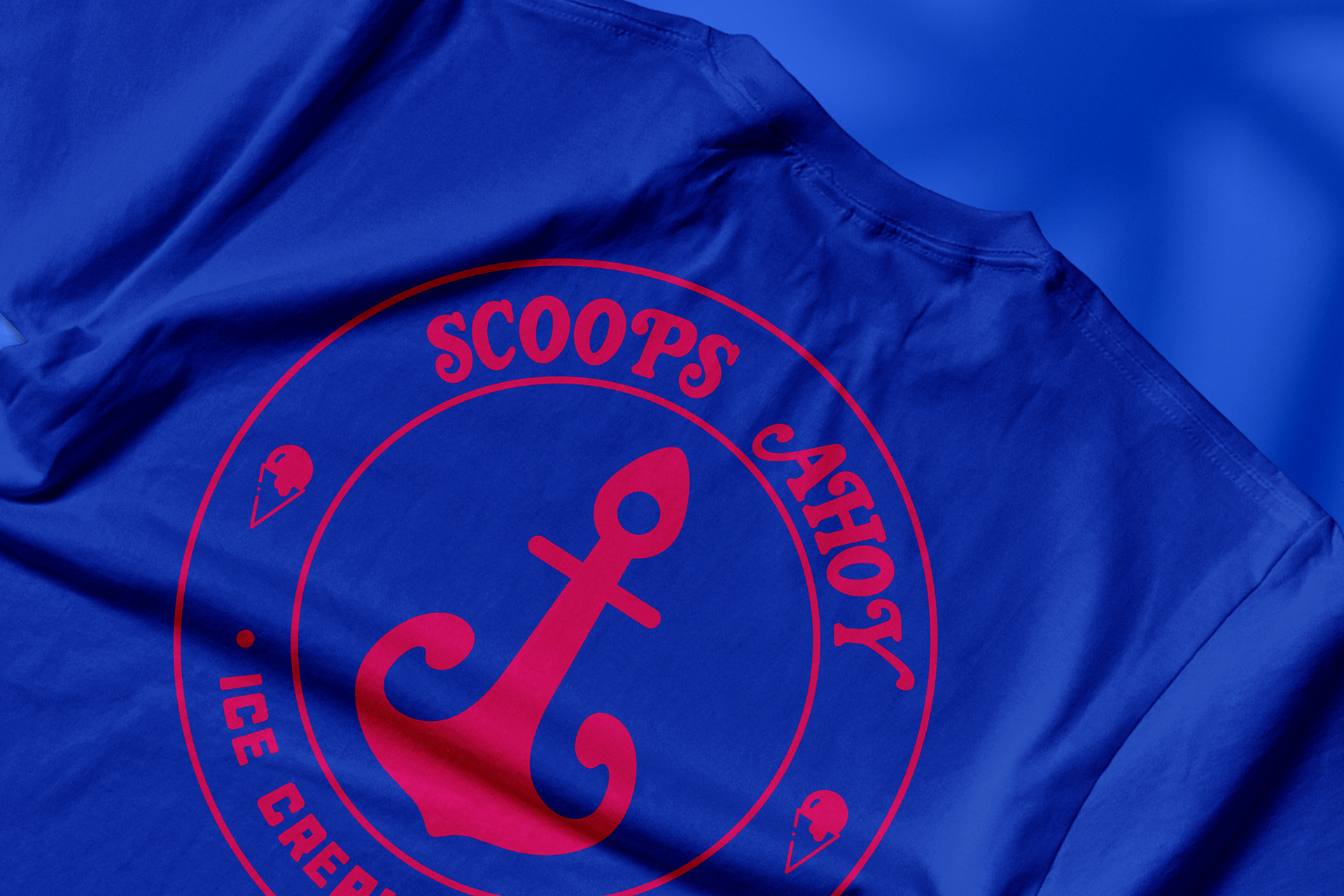
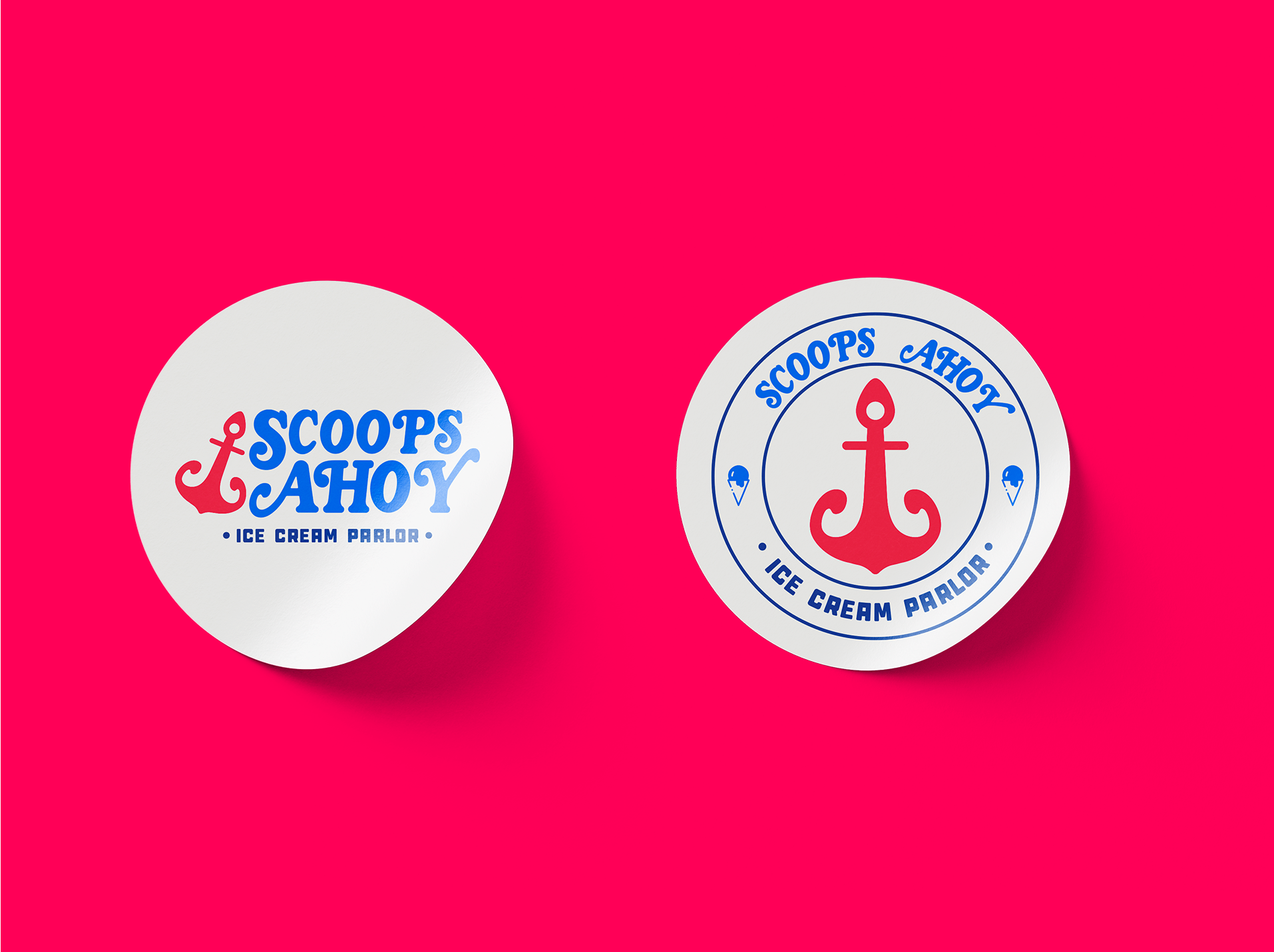
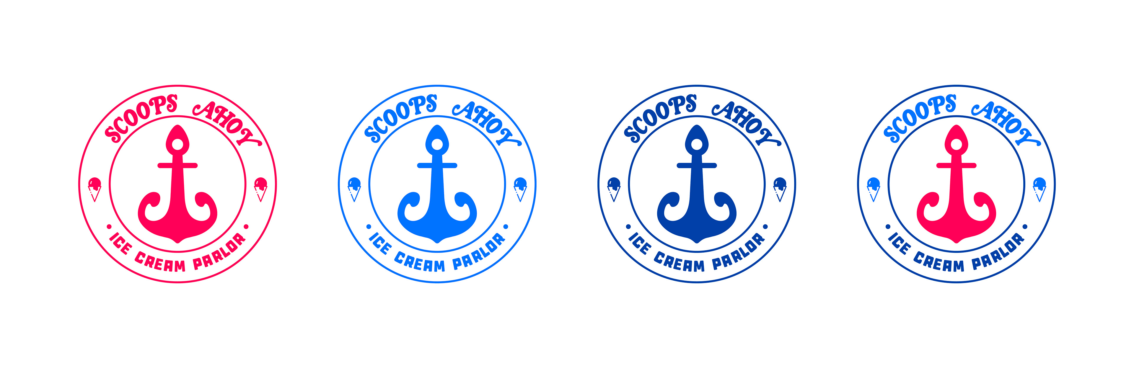
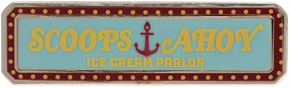
I didn’t want to completely change the logo so I kept the anchor and the text, but I redesign it to a fresh and colorful logo, that way there’s more variety of colors to play with fun merchandise.
CAPABILITIES
Brand Identity
Copywritting
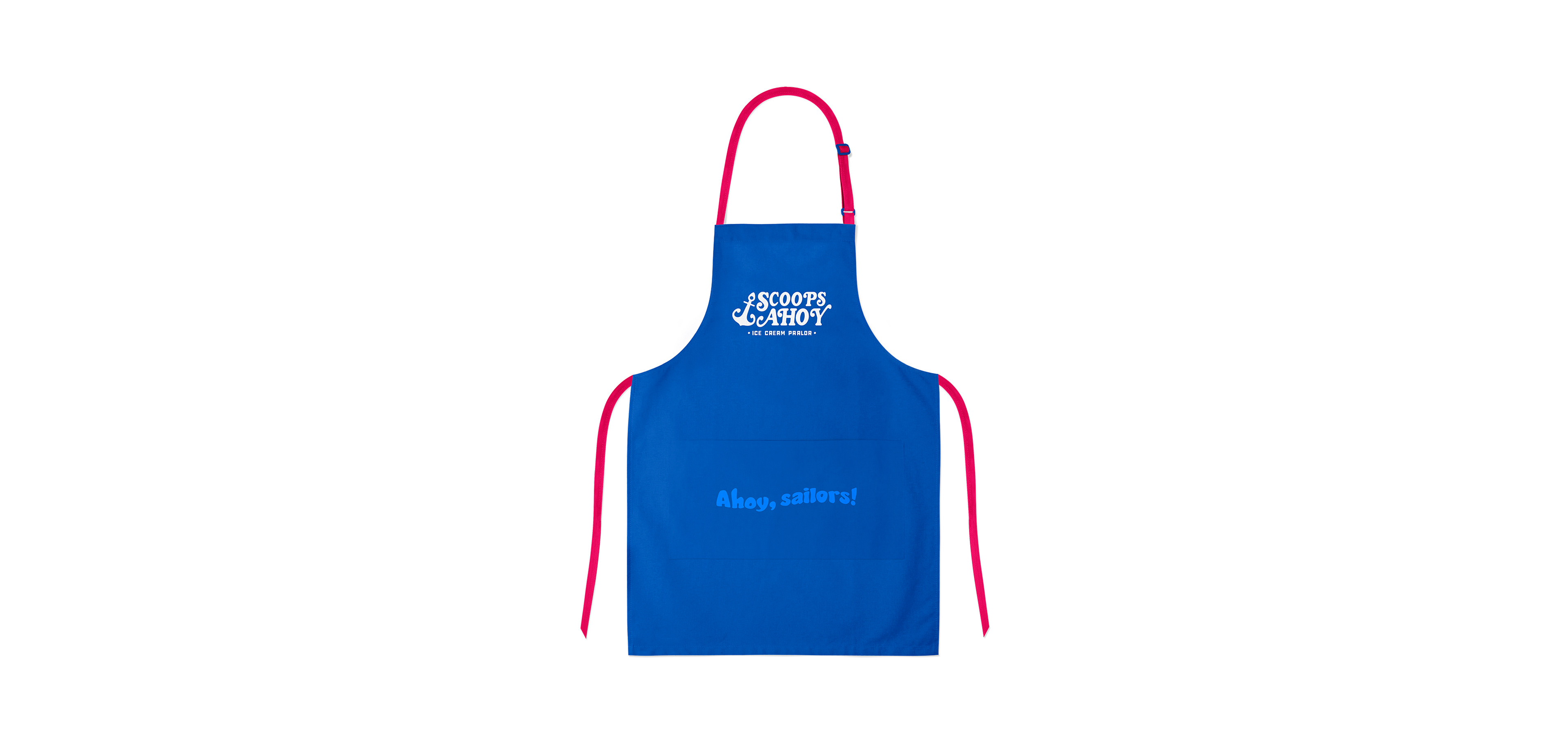
Packaging
Brand Activation
Custom Type
Animation
FEATURED
Dessert Company
Netflix Show
Brand New
80’s origin
Original brand design from the show:
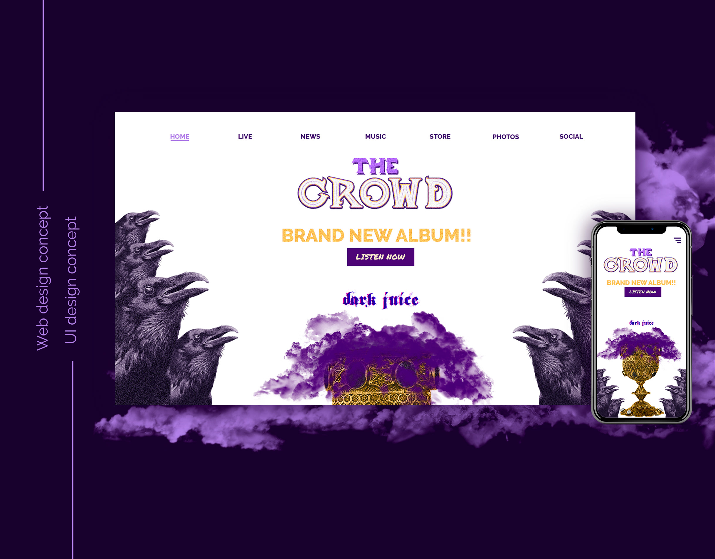
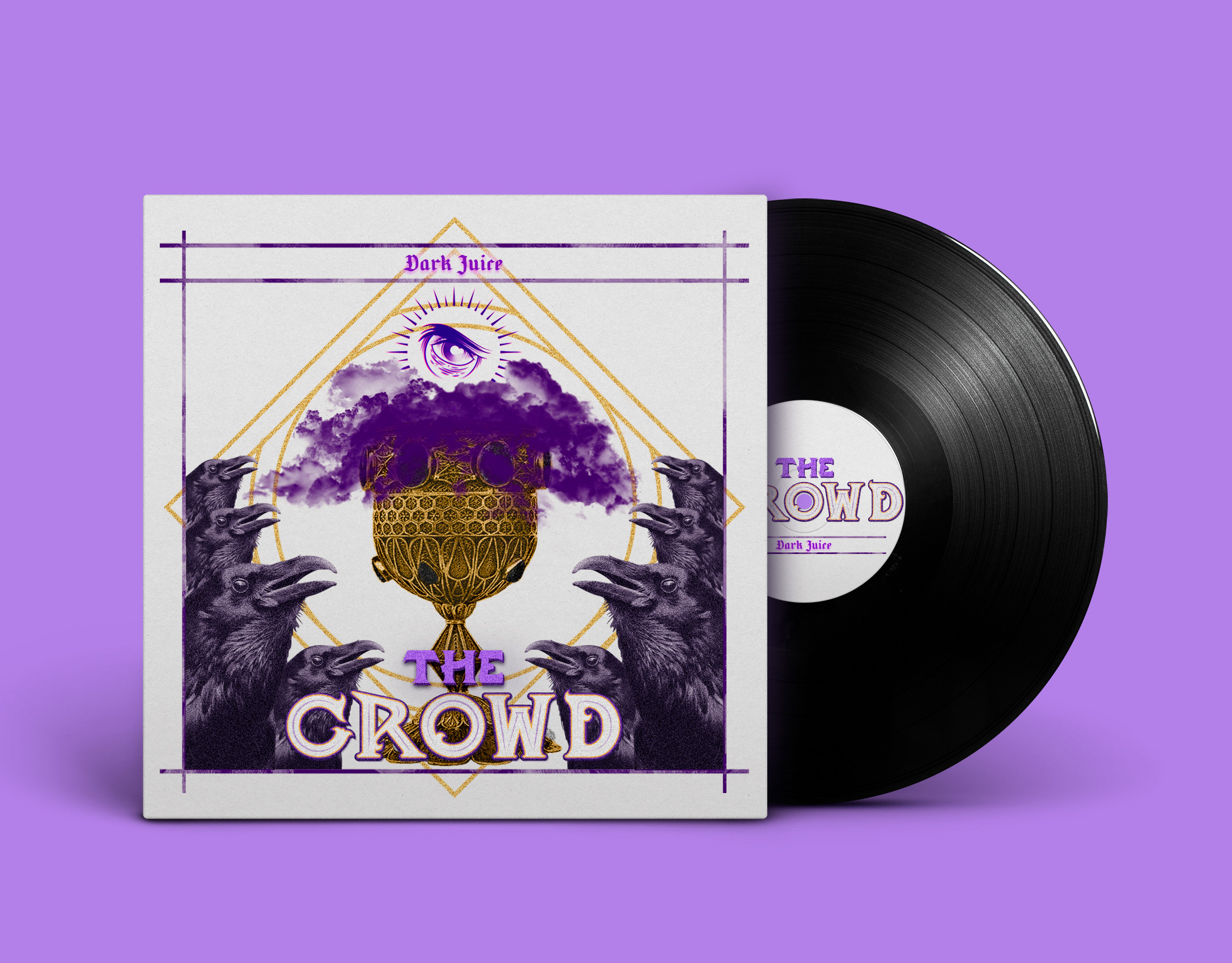
My adventure redesigning it: